Insider 4-13-2017

When I read the description for Mortenebra, Numen of Necrogenesis, I immediately jumped at the chance to take it on. I rarely have the time to do concept art these days, so I was overjoyed to find a brief moment when I was able to generate an approved silhouette and initial sketches before I handed off the hard part to Carlos Cabrera.
Some of the design details included in her concept art description were:
• This time, she has had her consciousness transferred into a larger, more menacing mechanikal body.
• She has changed out a more petite form for a larger form more suitable for warfare and heavy industry.
• Her flesh and bone bits seem to be her head with an indeterminate amount in her torso. That flesh should be placed high up in a in a kind of giant mechanical centipede. The overall design should reflect Mortenebra’s alien nature along with an insect-like anatomy assembled from iron bones and chitinous plates.
(Do a search for “Willem Dafoe smiling.gif”—that was my face when I read that last line and I immediately said, “Mine!”)
• It should have a mass of legs running up its body, similar to those of her original form, but those legs gradually evolve from spikes that hold her up to appendages ending is tools for use on the battlefield or in her workshop (industrial clamps, drills, saws, etc.). Finally, her last two sets of limbs should echo her original incarnation, with a spindly pair of humanoid arms and a pair of large, heavy-duty claws reaching up over her shoulders.
• The body itself should be more reminiscent of a flexing metal spinal column than a bulbous insect body. The use of negative space will make this model stand apart from the Cankerworm warjack (see FoW: Cryx, p. 75).
• It would be cool to see her body rearing upward, her back arched and with her humanoid arms thrown backward as if working magic (see FoW: Cryx, p.51) while her heavy claws reach out menacingly.
• Mortenebra is also a former member of the Convergence of Cyriss, and it would be cool to see some their Art Deco design sensibilities repeated in this model. She should look graceful, industrial, and terrifying.
The written concept spoke to me on many levels, as I’m a big fan of insect monsters and mechanical design; however, there were a few things in the concept that were red flags for production, so I tried to focus on the basics of table presence, magic, and big pincer arms. I almost always start off by generating a bunch of silhouette sketches to get a feel for how I’d like the model to look on the table and to explore its shapes.
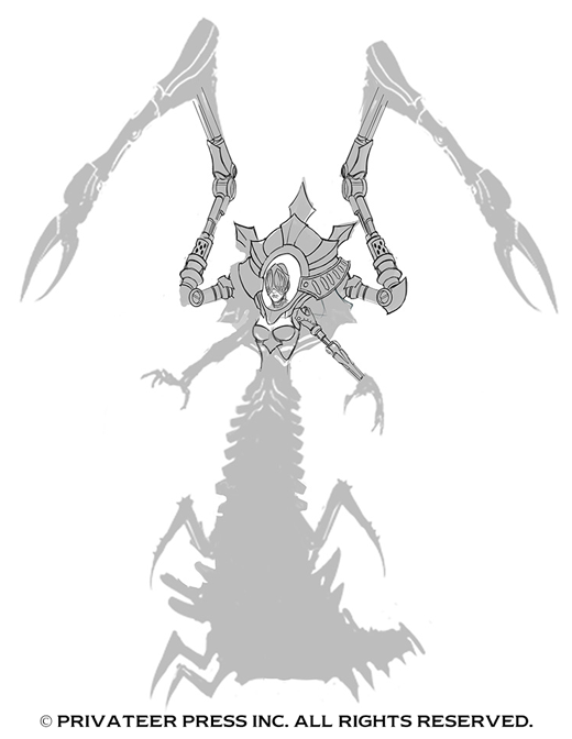
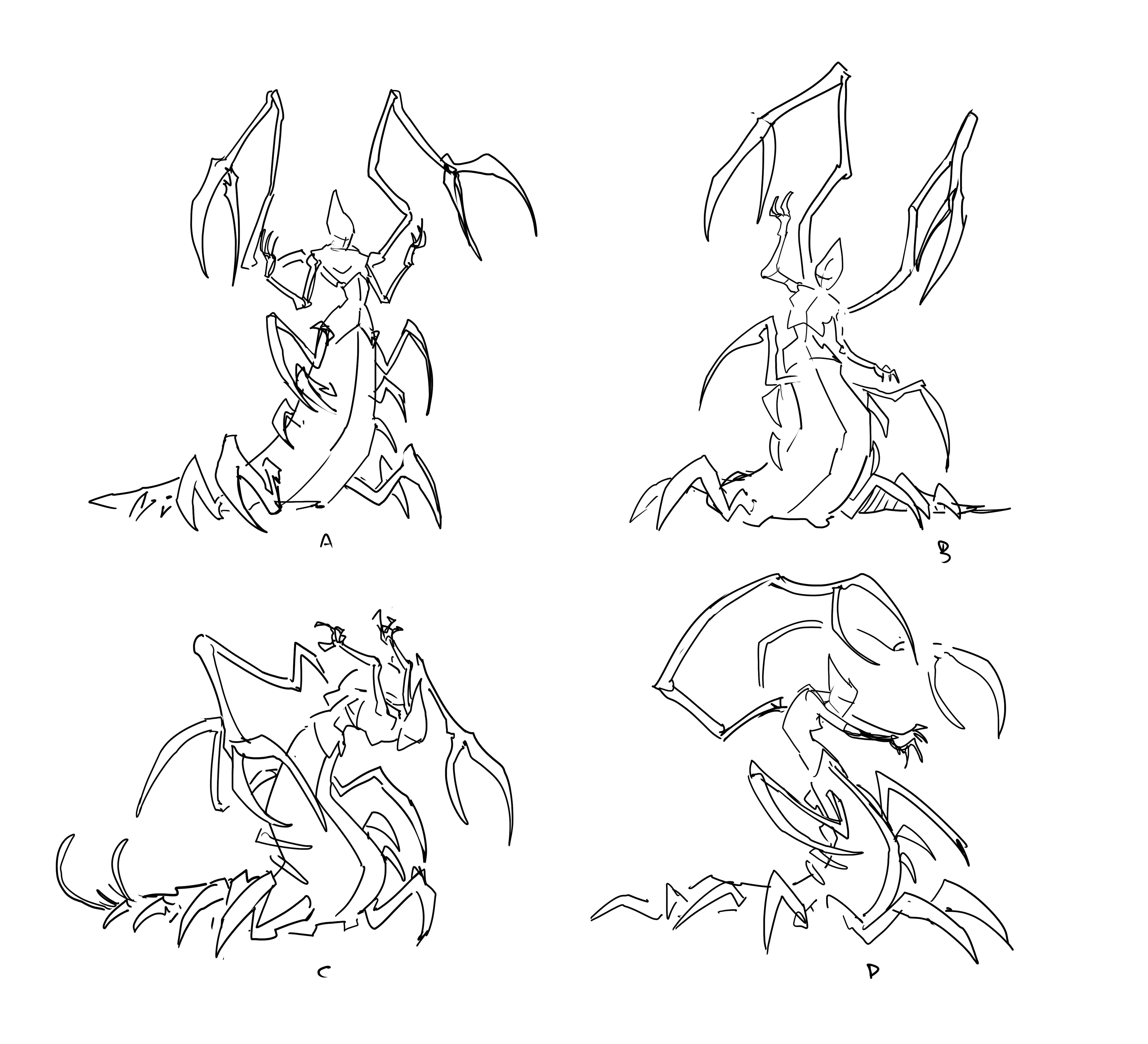
In reading the description, the first thing that came to my mind was a combination of a silverfish and the feel of a hatching cicada. Based on that, I roughed out these silhouettes. The awesome part about designing in silhouette is that you can immediately get a good feel for what the character might look like on the table. I liked the upper body of B, the wasp-like waist of E, the pincers of E, and the legs from B. The group agreed, so I quickly bashed together this silhouette.
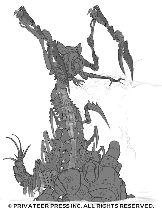
With an approved silhouette, I typically proceed to line art.
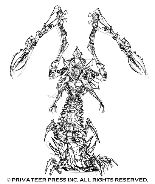
This is as far as I got before other work tasks starting kicking my butt. Playing off of the note about Convergence, I tried to incorporate in a bit of the Art Deco look to the top of the backpack. This detail ended up getting scrapped, though, and I ultimately decided to let Carlos have some fun.
In this first sketch, I thought he got the basic idea of the shapes I was thinking about, and so I had nothing to add.
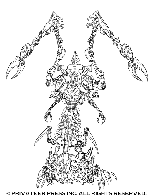
He then sketched up this next image. The first note is that I wanted to bring back Mortenebra’s mechanical arms, and the claws in this sketch lost the long, sharp, and pointy feel of the pincer claws. The central smokestack above her head also wasn’t working—it was overwhelming the upper torso and making her too advanced. To pare that down, I requested Carlos remove the central smokestack and lengthen the pincers (mechanical arms and highest set). One last note was that Mark Christensen (Production Manager) was terrified by how complicated the back side of the centipede body was (sketch not pictured), so the proposed fix was to throw a piece of cloth over the top to simplify that area in casting and add a smooth area to break up the shapes. I’m positive I provided a quick sketch over the top to help with details…but that file has been lost to the digital ether.
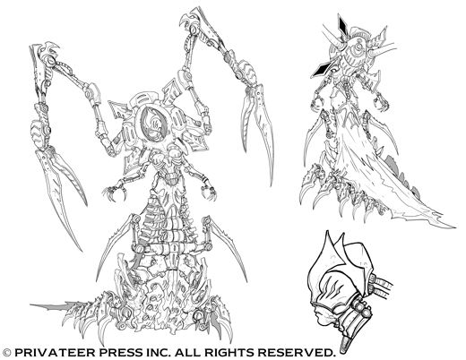
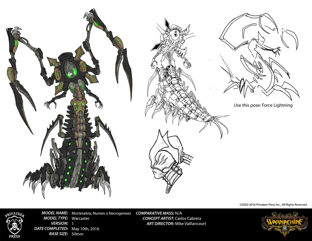
Carlos then sent along this sketch, which was approved as final. The last thing we had to figure out was her pose. My suggestion was to go with a force lightning pose with her casting a spell.
Carlos nailed what I wanted in pose D. The group agreed, and we approved the final concept art, which I then colored for the studio paint scheme reference and illustration.
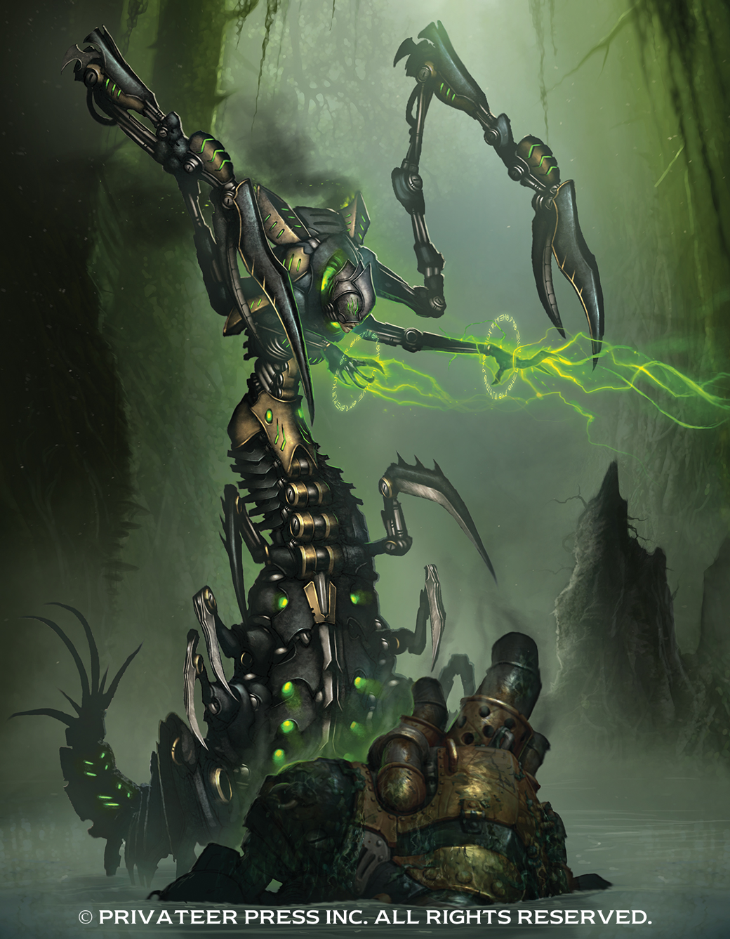
Here you see the final concept art. Following up on the concept, I had to commission the illustration for her to go into the Cryx Command book. For this task, I tapped Hardy Fowler. Hardy and I worked together on several illustrations in the Command books, and I knew I could trust him to knock this one out of the park. My short description for the illustration was
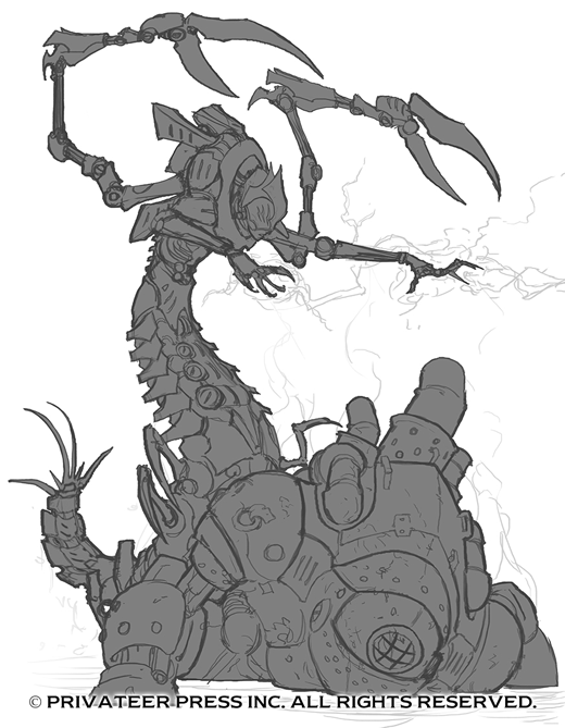
Inside a swamp-like environment Mortenebra crawls over the top of a half-submerged and destroyed Mariner warjack. She is casting a spell that looks like a green version of force lightning. I will provide the spell rune that should be around her hands as we get closer to completion. The Mariner is 13′ tall (just for scale comparison) and Mortenebra is around 12′ tall (including the big arms coming off the back). Smoke and green sparks billow out of her smokestacks. In the background, we might see an old swamp shack and a Necrotite mining light.
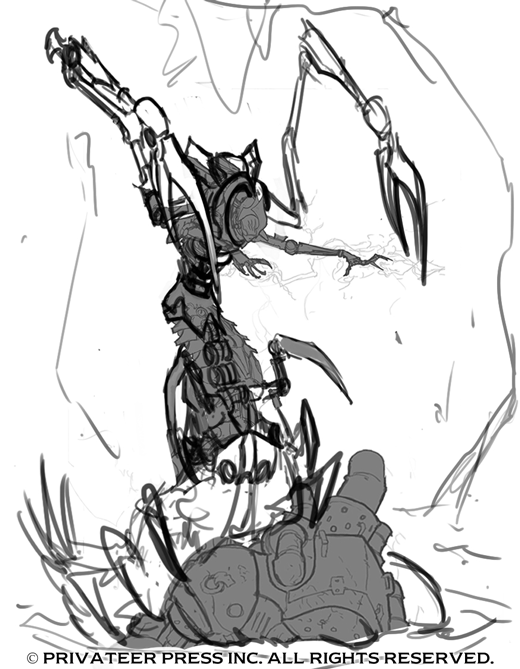
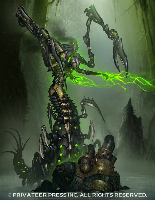
In this first sketch, Hardy did a solid job overall; however, there were a few things that weren’t quite working in comparison to the concept and composition. I typically provide quick sketches to help visualize the adjustments I’m requesting and to help take any guess work out of revisions. Here you can see the sketch I provided alongside the original sketch Hardy sent me.
The first thing we needed to adjust was the mass of her large mechanical arms. Those arms can create some issues working within the frame, so I pulled the camera back and rotated the arms down. This also helps bring the eyes down to the Mariner that’s submerged. I also pushed the Mariner farther underwater, adjusted the backpack, and added more height through the lower body area so we had the accurate number of segments. I also loosely hinted at some cypress trees around the edges, which I noted in the email I sent to Hardy.
Hardy then sent me a revised sketch to make sure all the details were accurate before moving forward. He covered all of my revisions and then proceeded to color.
Hardy’s proposed final (sans rune circle) is seen here side by side with the final art in which I provided him with the runes I described earlier. The one thing you’ll notice is how the glowing green bits become de-saturated in the final. This is common when converting art from RGB to CMYK, and if it’s not caught early on in the process, it can create a problem. The easiest way to get around this is to work in CMYK if the illustration is intended for print. Ultimately, I think Hardy did a fantastic job, and I’m very happy with how she looks in the book.
*click for larger image
I hope you enjoyed seeing a bit more about the development of Mortenebra, Numen of Necrogenesis’ concept art and illustration. If you have any requests for future art Insiders, feel free to drop me a line on the forums by sending a message to PPS_Mike V.


